Delete extra colors from your document to simplify prepress work
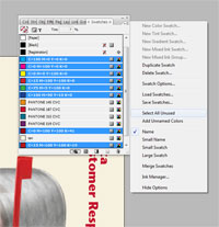
Delete all non-used colors. Going through this process will eliminate the possibility of incorrect conversion of “extra” colors to four-color process. Do not use RGB colors in your document. RGB describes computer monitor color and must be converted to reproduce on paper.
When using Pantone colors, use consistent color names in your documents
Use correct and consistent names within a file and from project to project. Using names such as blue, regal blue or royal blue is asking for problems. Use Pantone 286 blue and everyone will know what color is desired.
Pantone colors can shift on colored stocks. An “ink draw down” will show you potential problems
All offset printing inks are transparent (even when called “opaque”). Because of this the color of the paper stock being printed will show through the ink, creating a secondary color. For example, if you print blue ink on yellow paper the color of the image will be green.
To eliminate surprises such as this, an ink draw down is prepared using the actual color of ink on the actual paper stock. If the desired color cannot be achieved, the only option is to use white paper printing both the background and image colors.
Use Pantone Color Guides when specifying ink colors
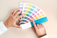
The Pantone Matching System, commonly referred to as PMS, is a system of color chips identified by number. When PMS 286 is specified, the printer can refer to their PMS swatch book to see the same color of blue as the designer.
Paper surface will change the way some color reproduces. To compensate for color shifts there are three types of swatch books. The primary book will have gloss coated paper and uncoated paper sections. There is a second book for matte paper.
Which book or section referenced to is determined by the paper stock used for the project.
Because of the limitations of 4-color process, converted colors will not exactly match the PMS ink colors. Some colors are very close, some are quite different. To see the outcome, refer to the Pantone Solid-to-Process Guide. Do not rely on your monitor or software program conversion without referring to the Solid-to-Process Guide.
Making color changes at the color proof stage can be very expensive.
Pantone swatch books may be purchased at www.pantone.com.
PMS expectations—how to get what you want
Why is it a problem to match a PMS color? In some cases, there is significant variation in color from PMS book to PMS book. The age of the book and where it was used influences the extent of fade or change in color. A PMS swatch book stored in the back seat of a vehicle or under the lights of a pressroom will “age” differently from a PMS book kept in a desk drawer for several years.
When a print buyer specifies a PMS color that is not accompanied by an approved swatch, what the print buyer really wants is a match of that PMS color.
The challenge is that particular ink may appear different on different paper stocks. A deep red color in the PMS book, for instance, may appear maroon when used on a recycled offset stock.
We recommend attaching an initialed color swatch when you specify a PMS color and state that you want a match of that color, not simply use the ink. And, if you are concerned about how your ink will print on a color stock, also ask for an ink draw down.
Reflex blue and metallic colors will require a spot varnish for stability
When printing PMS colors that have Reflex blue or metallic color as part of the formulation, special consideration has to be given—an extended drying time or adding a varnish is required to eliminate marking or scuffing. If the client’s schedule will not allow for the required drying time, the work-around is to spot varnish the color to seal it.
Eliminate pages of heavy ink coverage— it increases make-ready and press time
Avoid using solids that exceed 50% of the area of the page or have a 100% PMS color. It is simpler to print 100% of the page with a 10% screen of the PMS color.
When printing full color pictures, complexity increases as the size of the picture becomes larger, and the ink density of the combined colors increases.
Simpler press forms mean reduced make-ready times and faster press running speeds resulting in lower costs.
When printing in offset litho, plan on 2, 4 or 6 colors for greatest value
When printing four-color process and a spot color (PMS), consider converting PMS colors to process rather than printing it as a spot color. This will give you a better price for your job. But remember, the color may change when converted. Check the Pantone Solid to Process swatch book to see how your particular color will convert. Brilliant colors tend to shift and are often better printed as spot colors.
“Perfecting” presses print both sides of the sheet in a single pass
The advantage of printing both sides of the press sheet in a single pass is lower cost and shorter production schedules.
Projects that lend themselves to a perfecting press have ink coverage requirements of less than 25%, are 1- or 2-color runs, and print on uncoated book weight papers.
In your written specifications, indicate the possibility that the project could perfect and discuss design considerations with your print representative.
See also:
RGB vs CMYK
Images and Ink
Communicating with Color
Paper and Ink
Printing Resources
Request a quote or consultation
Purchase printing, upload your PDF or design online